Joe Muggs Coffee Rebrand
Books-A-Million, Inc.
Birmingham, AL
Involvement
Creative Direction/Strategy
Credits
- McGinty Co, Art Direction, Production
- Steven Lyons, Creative Director
Joe Muggs is the in-house coffee shop brand of Books-A-Million. In 2007, it was faced with stagnant sales despite overall same-store growth. It was lacking cohesiveness as a brand, focusing more on individual promotions and products than a complete brand position. Even new store and cafe designs didn’t reliably increase sales. We needed to start a fresh pot.
Using the launch of a ‘New & Improved’ Joe’s Choice Premium Coffee, I initiated a rebranding and refocus for cafe marketing. Incorporating the wood elements brought to other parts of the store design as foundation, we focused on a brighter brand palette while simplifying the imagery. Using a layered, letterpress-style look within every element, presented the brand as more of an everyman cafe. This ran counter to the high-end, photorealistic direction of Starbucks, Caribou and others. During this time, we were beginning a multi-year process of opening standalone cafe newsstands to directly compete against these brands.
Running through the majority of that sales year, the Premium Coffee launch generated a 6% increase in the first quarter alone after being stagnant during the prior 3 quarters. The brand style was incorporated into new illustrated drink marketing, a new style of coffee packaging, menu boards, and other POP materials. Sales increased each quarter with year-over-year sales increasing the following year as new marketing continued to roll out.
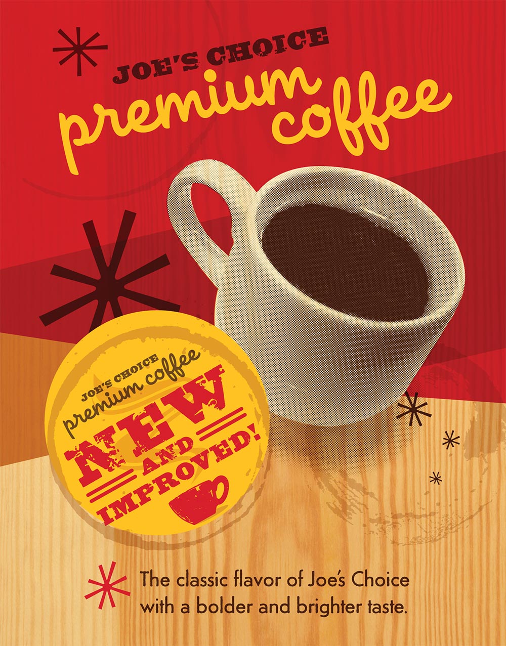
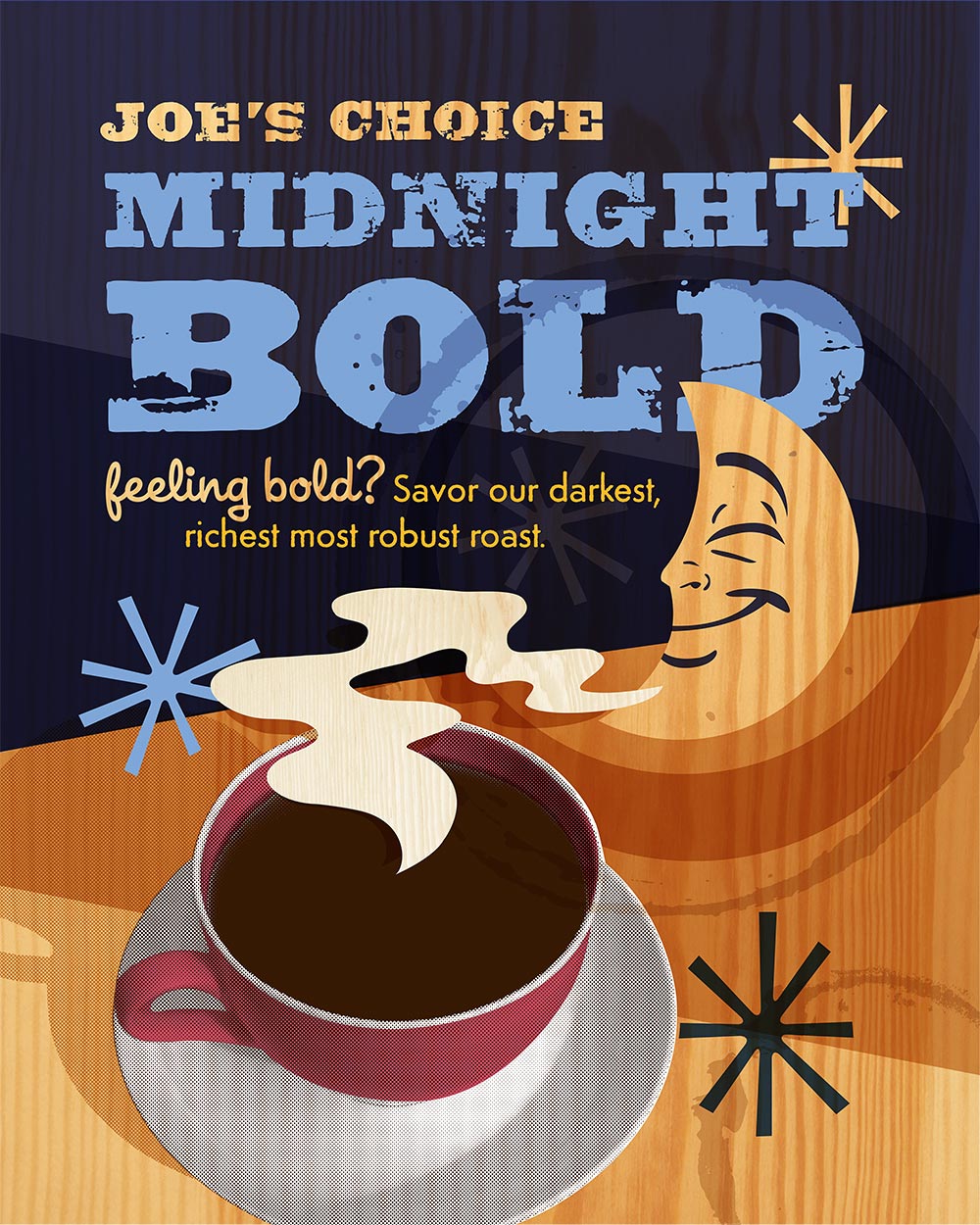
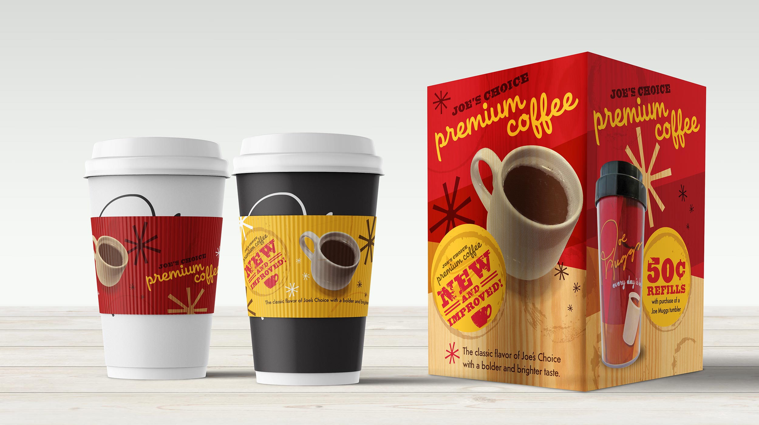
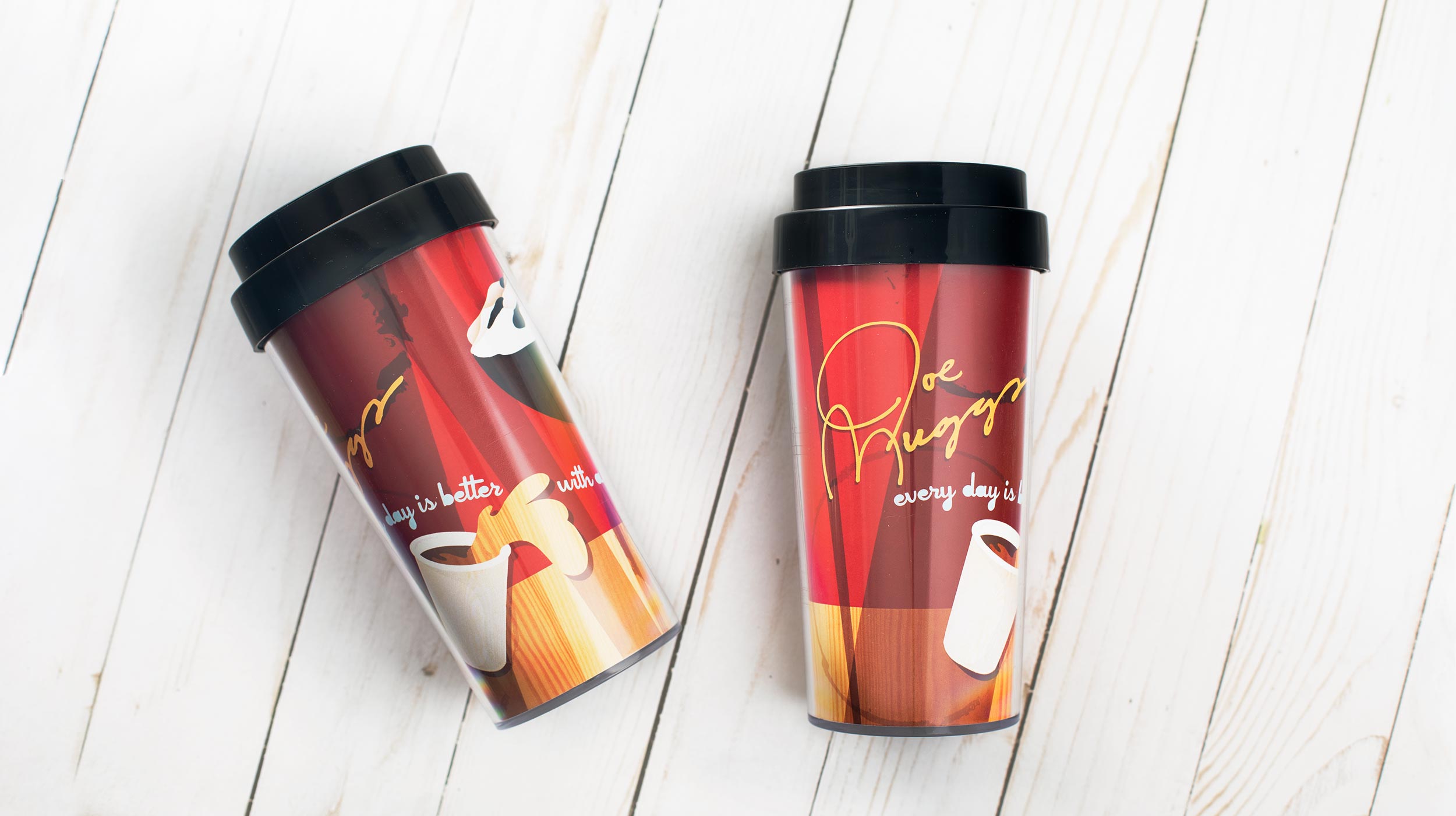
The Joe’s Choice Premium Coffee launch was the intial campaign using our new brand style. The red and yellow primary “new and improved” message was used on menu board posters, java jackets, tablet tents, window posters, and other POP materials. We also developed an accompanying campaign with a branded coffee tumbler customers could purchase and receive discounted refills. The Joe’s Choice coffee blends, like Midnight Bold, utilized a similar treatment for continuity with a complimentary palette.
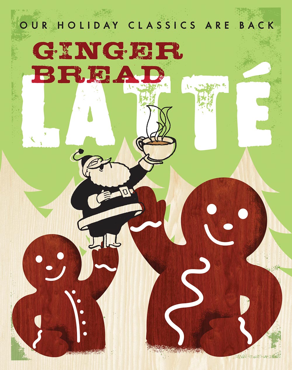
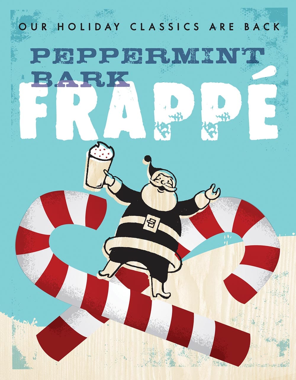
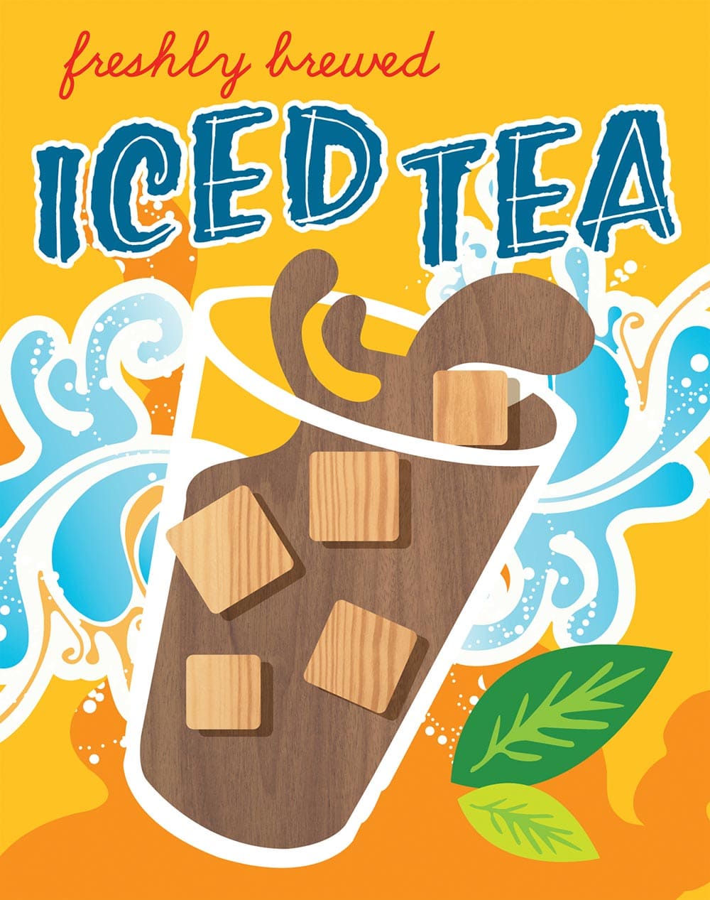
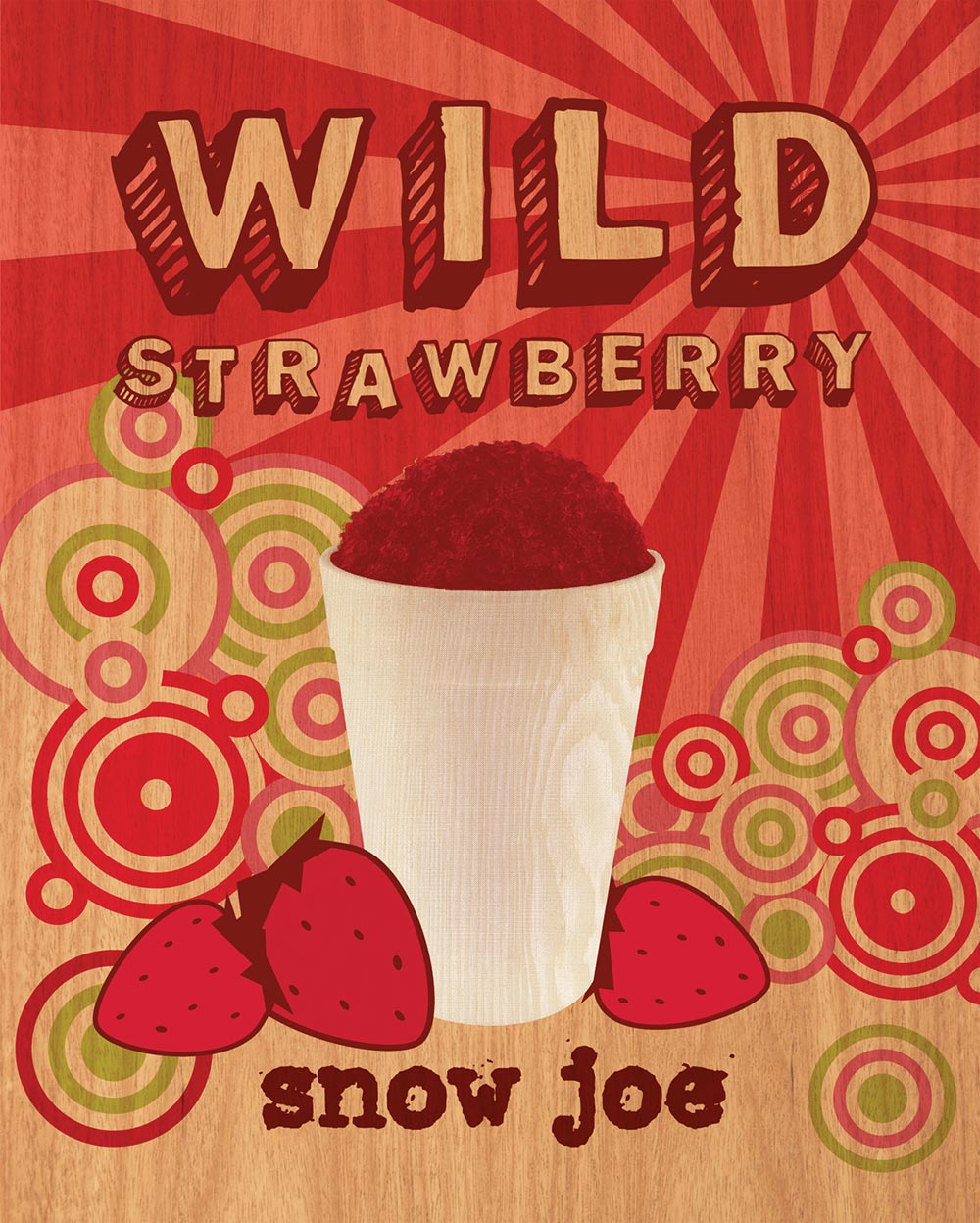
Individual drink campaigns utilized their own unique illustration, imagery, and/or palette, but were still bound to the overarching brand style to tie them to the brand. Woodgrains, rustic letterpress-style illustrations, typography, and overprints, were elements included in each piece. Overall, the rebranding brought a cohesiveness to cafe merchandising and marketing, reaffirming messaging throughout the store and cafe.